Sign up for our LAVY email
and get our bi-monthly newsletter.
Pity the healthcare shopper.
A co-worker was helping his adult son shop for health insurance in Colorado. With dreams of inexpensive coverage, he accessed the Connect for Health Colorado website, the state’s healthcare insurance exchange.
After a few quick questions about location, age, gender and tobacco use, coverage options were displayed. Couldn’t be any easier, right? Wrong. The website displayed a dizzying 50 available plans, with multiple pages and listings. The choices presented confusing columns showing monthly premiums, annual cost estimates, deductibles, maximum costs, and incomprehensible plan names such as Connect Flex Gold and Bronze Pathway. Multiple plans from Cigna, Kaiser Permanente, Bright Health, Anthem BlueCross BlueShield and Elevate were almost impossible to differentiate.
With a headache coming on, our co-worker gave up and tabled the decision for another day. He’s a bright guy. So is his son. If they couldn’t navigate the system, what does that mean for everyone else in Colorado?
Sadly, this problem isn’t restricted only to the Centennial State. Hard-to-understand websites with poor user-experience design are rampant in the healthcare community. From hospitals to health plans, consumers must brace themselves when going online where they are faced with antiquated interfaces and uncomfortable online user experiences.
 Healthcare isn’t the only industry afflicted with poor user experience. But the stakes are higher. Inferior healthcare website design can lead to consumers making poor healthcare decisions or, worse yet, no decision at all.
It appears that healthcare companies might not care that their websites are difficult to understand. Nor do they seem to grasp how difficult it is to make a reasoned choice when presented with dozens of baffling options. You will have trouble finding sleek, intuitive health websites that delight users with an amazing experience.
But we’ll cut them a break. Marketing health-related services isn’t the same as selling shoes. Hospitals and insurance plans have interactive systems designed by regulators, physicians and lawyers. Small print, legalese and industry jargon reign supreme. It’s no wonder hospital and health plan websites are so clunky.
There are a number of other reasons healthcare organizations haven’t focused on improving user experience.
First, it’s fair to acknowledge the complexity of their services. Hospitals and health plans struggle with HIPAA privacy regulations and the disruption brought by the Affordable Care Act. They worry that simplifying their online interface could expose them to liability. And, of course, updating their aging legacy systems could prove expensive and arduous.
Many healthcare websites, especially for health plans, were never built for consumers. Insurance companies’ primary customers were employers and the government, two groups that seem to embrace red tape and labyrinth-like systems. But individual consumers are now entering the insurance market in a big way.
For these and other reasons, the healthcare industry has lagged behind trends that emphasize UX (user experience) and designs that help viewers quickly find what they’re looking for. For every company that truly understands consumer behavior—see Uber or the Google Store for great examples—you’ll find dozens of healthcare companies that seem terrified of tackling complex change.
A quick answer to that question is “any business that wants to survive.” The Stanford Web Credibility Project estimates that nearly half of all consumers judge a company by its website’s design and usability. And according to McKinsey & Company, 70% of buying experiences are based on how well a customer is treated. Here’s one more statistic worth noting: The Nielsen Norman Group reports that we’ll leave a web page in less than 20 seconds if a clear value proposition isn’t presented.
Got it? Our attention spans are short. We judge companies by how easy it is to understand them. We care about usability—which translates loosely to human-centered design. Sounds like millennials, right? Exactly.
Do companies care about millennials? Yes, if they want to stay in business. With 87 million in their ranks, there are more millennials (those born between 1982 and 2004) than baby boomers. They’ve grown up with technology, are increasingly narcissistic and often exhibit traits of entitlement. This is a demanding population with no patience for complex bureaucracy.
Millennials are shopping for health insurance. As they age, they will be forced to interface with hospitals and physicians, often through human-computer interaction. This group is driving the healthcare UX discussion. It’s true that millennials can be demanding, but that’s a good thing when it comes to healthcare. Millennials are compelling healthcare-related businesses to finally address the online experience as a way to encourage visits to your physical location.
Solving problems with simplicity and elegance are the hallmarks of excellent user experience. No one wants to struggle when sitting in front of a computer. And when space is at a premium on small smartphone screens, we don’t have the patience to hunt for things.
This is why we are so satisfied when things work the way they should. Uber was founded in 2009. Today, some estimate the ridesharing app is worth $70 billion. Whether or not the company should receive such an astronomical valuation, no one doubts that Uber solved a problem in a satisfying way. No more dialing for taxis. No more standing in the rain with your hand in the air. No more wondering if your ride will arrive. You order a car with one click and watch your smartphone as a car snakes its way toward you. It's clearly based on a human-centered design.
Imagine checking in at an emergency room the same way. What if you could buy health insurance as easily?
Let’s return to our co-worker’s frustration with the Colorado health insurance program. Too many choices gave him a headache and forced him to stop shopping. A number of studies predicted his behavior.
We all want choice. That’s what freedom is about. That’s what makes us happy. But too much choice—especially in areas that are complex and difficult to understand—will cause stress and work against rational judgement. When you combine too many choices with an area of great concern—health, anyone?—then you’ve got a recipe for indecision. This choice overload causes us to take decision-making shortcuts—we’ll choose a brand name even though it might not be the best choice. We’ll ask a friend. Or we’ll look for a different solution altogether.
Health plans should limit options. If the Connect for Colorado website had presented only three plans, it’s probable that one of the presented companies would already be collecting premiums from our co-worker. That's the secret of great design thinking. Often, less is more.
Whittling the Colorado list from 50 down to three plans isn’t a pipe dream. A smart UX approach can make that happen using an intelligent faceted search—presenting interim or up-front questions people can easily answer before being presented with buying options. Here’s how that might work.
 The clock is ticking
Time is running out for healthcare companies to revamp the online experiences they offer to customers and prospects. While they are playing catch-up, they have left themselves exposed to upstarts hungry to disrupt the industry. Just as it’s now becoming significantly easier to buy or refinance a home, it won’t be long before health insurance will be sold the same way. And don’t be surprised if hospitals allow you to check in and wait at home before heading to emergency room. Wait. That’s already being done by Dignity Health through InQuicker.
As to our co-worker, all turned out well. Despite the Colorado website’s poor interface, he persevered and helped his son to select the right insurance plan. Maybe.
Not sure where to start? No problem. LAVIDGE experts in developing user-friendly websites for healthcare professionals can point the way.
To learn more, give us a call at 480.998.2600 or send email to info@lavidge.com.
Here are some elements to include when you're ready to overhaul your health plan website.
Prominently feature a physician search function on your home page. Consumers want to keep their doctors, so give them an easy way to discover which plans list their doctors.
Help prospects to dramatically narrow plan options by asking a few questions, such as income, number of family members, and whether they prefer high or low deductibles. Lead with a tool that presents only the three best health plans for each consumer.
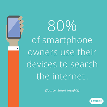
80% of smartphone owners use their devices to search the internet.* That means they’re likely to first visit your website on a small screen. Use a mobile first design strategy, which will help you simplify and eliminate unnecessary elements.
Throw out the tired gold/silver/bronze vernacular and opt for more friendly and understandable terms such as “budget friendly plan” or “pay more later plan.”
Sign up for our LAVY email
and get our bi-monthly newsletter.